
 Sign in
Gaia EDR3 - Star Trails - Gaia
Following the journey of stars across the sky
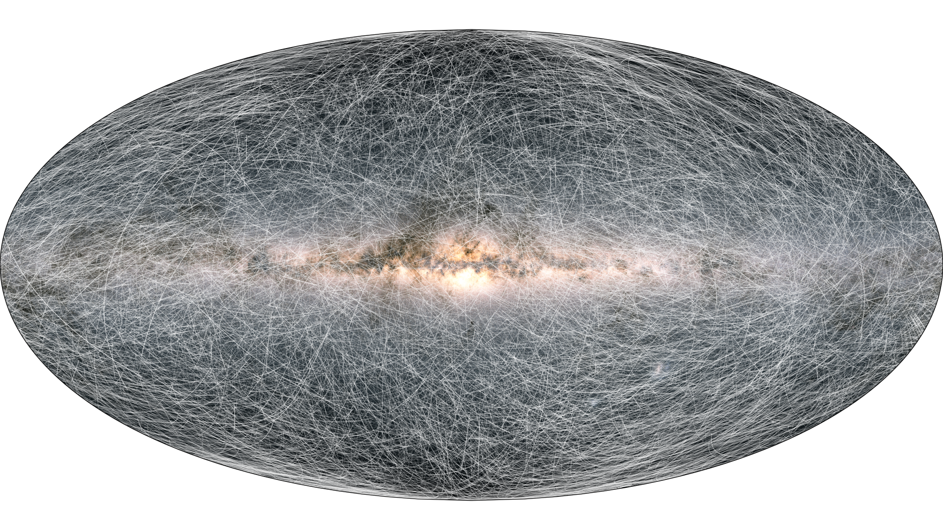
Figure 1. The trails on this image show the displacement of stars on the sky 400 thousand years into the future. (Good resolution image for download, High resolution image for download) Credit: ESA/Gaia/DPAC, CC BY-SA 3.0 IGO.
A major improvement in Gaia Early Data Release 3 (Gaia EDR3) with respect to Gaia DR2 is the precision to which the motions of stars across the sky, the so-called proper motions, have been measured. The precision has increased by a factor of 2 because of the larger number of observations processed for Gaia EDR3 and the larger time difference between the first and last observation. We illustrate this through visualizing the motions of stars across the sky using the new Gaia EDR3 proper motions. The image above shows for 40 000 stars within 100 parsec distance from the sun how they move across the sky over 400 thousand years, each trail representing the displacement of one star. To make this more dynamic the following animation shows in short steps the displacements of these stars 1.6 million years into the future.
Visualisation 1: Animation showing the movement of stars on the sky 1.6 million years into the future. Credit: ESA/Gaia/DPAC, CC BY-SA 3.0 IGO.
There is a lot going on in this animation! We explain step by step what one can see. Refer back to the animation in between to see if you can spot the things described below:
The first frame shows the current positions on the sky for 40,000 stars within 100 parsecs (326 light-years) from the Sun. The dots also indicate the brightness of the stars. This information is based on the Gaia EDR3 positions and brightnesses of these stars.
The next few frames show trails starting from the locations of the stars. These trails indicate how the stars change position on the sky over time intervals of 80 000 years into the future. The trails also indicate the present-day brightness of the star they correspond to.
Next, the starting positions of the stars fade away and one sees only the trails of the stars moving across the sky. The trails are followed for 1.6 million years into the future.
The animation ends with the image shown at the top of this page. It shows the full star trails 400 thousand years into the future. The shorter time interval was chosen to avoid crowding the image too much with the star trails.
|
|
|
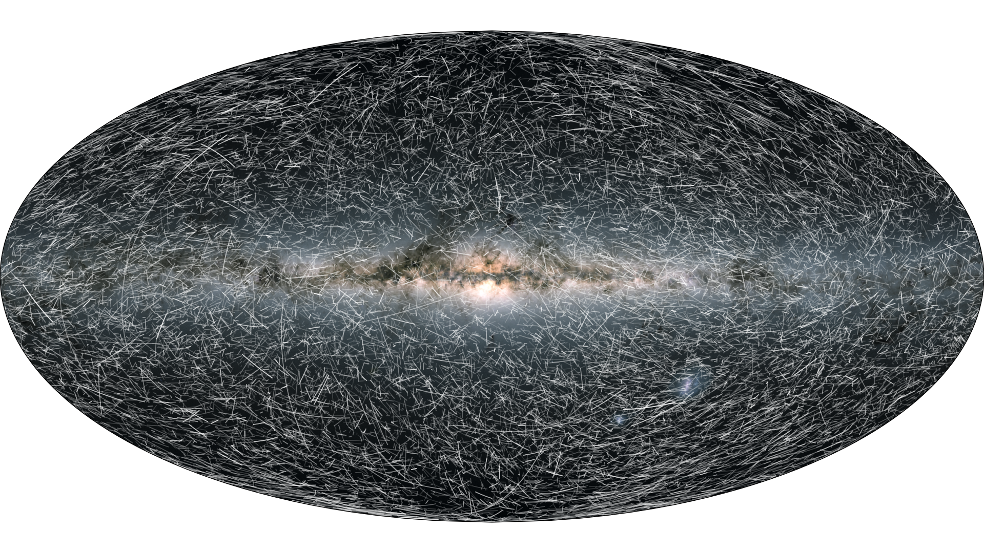
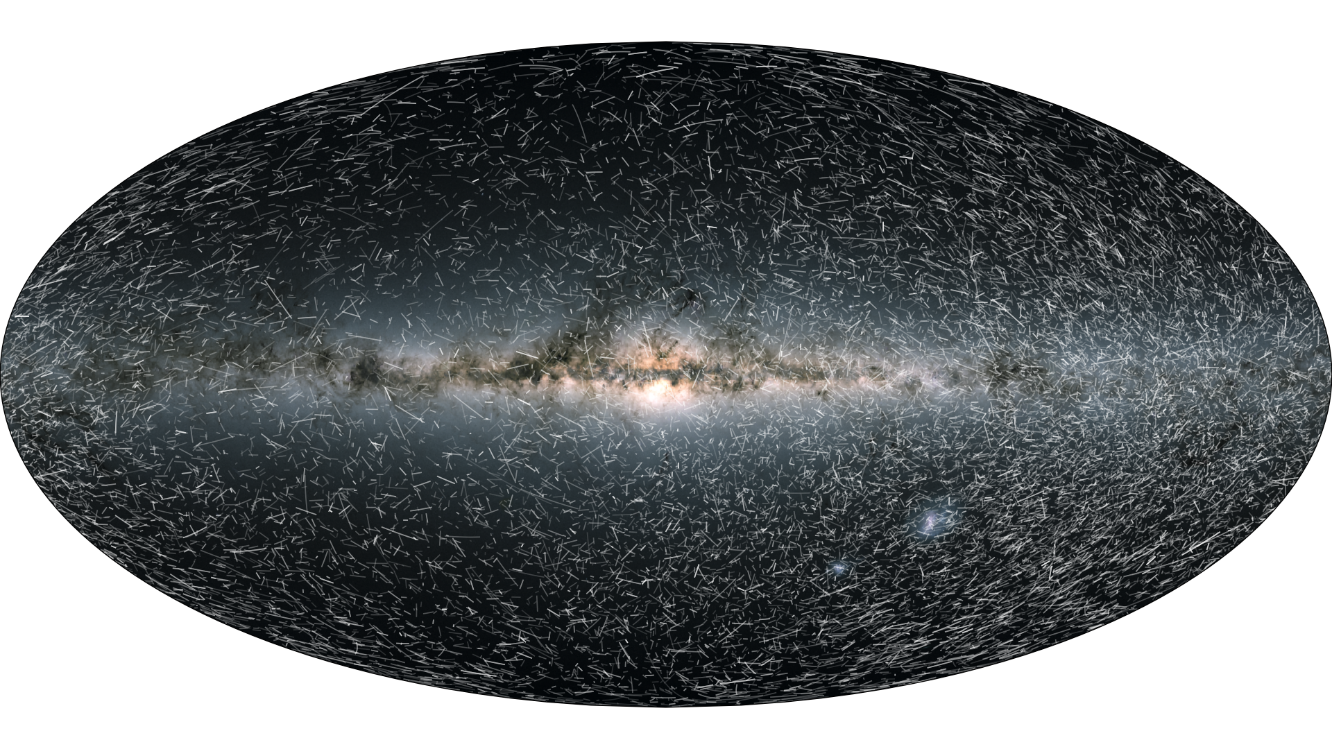
Figure 2. Left: View as extracted from the animation above, showing a variety of star trails. Right: Final frame of the animation. Note how the stars seem to have congregated on the right side of the image, while the left side appears emptied from stars. Credit: ESA/Gaia/DPAC, CC BY-SA 3.0 IGO.
If you look closely at the animation, there are several interesting things to note, which are also visible in the two stills from the animation shown in Figure 2.
There are short and long trails. The length of the trail indicates the displacement of the star on the sky over 80 000 years. Short trails indicate that the star moves slowly across the sky, while long trails indicate a faster motion. The motion of a star across the sky, its proper motion, reflects the motion of the star through space with respect to the solar system (from which we observe the star). The displacement on the sky is dictated by the distance of the star and the speed at which it moves. Stars that are nearby and moving at high speeds will change position across the sky quickly, while stars that move at intrinsically lower speeds or are far away will change position slowly. This explains why the short trails tend to be faint in appearance (the stars are far away) and the long trails bright (the stars are near).
If you look at the animation several times you will notice that sometimes a short trail turns into a long one and then turns back into a short trail. This indicates that the star is moving towards us and as it gets closer it will move ever faster across the sky. Once the star has passed us it will move away again and the trail consequently becomes shorter as the distance to the star increases.
Towards the end of the animation you can notice that the stars seem to congregate on the right side of the video, while the left side appears to empty. This is caused by the motion of the sun itself with respect to the average motion of the stars around us. The motion of the sun causes an apparent motion of the stars in the opposite direction. If you imagine yourself moving through a crowd of people (who are standing still), then in front of you the people will appear to move apart as you approach them, while behind you the people will appear to stand ever closer together as you move away from them. This effect also happens due to the motion of the sun with respect to the stars. Hence the sun is moving toward a point on the sky in the upper left quadrant of the video, while it moves away from the lower right quadrant. This is further explored below.
How realistic is this animation?
Good question! From the Gaia EDR3 catalogue we know for all the stars their current positions in space (from the parallax and position on the sky) and their motion in three dimensions (from the proper motion and radial velocity). The animation is based on predicting the positions of the stars in space, with respect to the Sun, over time. This prediction is scientifically correct and takes into account the effect of the radial velocity of the star which causes it to move closer or further away (for further reading: the predicted positions are calculated according to the prescriptions given in the Gaia EDR3 documentation). However, there are a number of simplifications that make the animation somewhat unrealistic.
In the calculations of the future positions of the they are assumed move uniformly through space, that is along straight lines at constant speeds. In reality the stars and the Sun describe curved orbits in the gravitational force field of the Milky Way. This will cause their relative motions to change slowly over time and this will affect where stars appear in the sky. However, over the 1.6 million years considered here the effect is irrelevant at the scale of the movie and images.
The animation shows only 40 000 stars within 100 parsec from the Sun. There are in fact many more stars within that distance from the Sun, and here only a random subset of stars is shown, those for which the radial velocity is known in Gaia EDR3 and for which the parallaxes are known to better than 10 percent.
If one wants to visualize the motion across the sky of stars within a 100 pc radius sphere around the Sun, we should also account for the fact that some stars will disappear beyond the boundary of the sphere, while other stars will enter the sphere as they approach us from beyond 100 pc. This is not taken into account in the simulation.
The brightness of the star trails is not adjusted according to the distance to the star, but always (incorrectly) reflects the present-day brightness as measured by Gaia from its location in the Solar system.
The animation was created by calculating the future star positions in Python and creating the frames with matplotlib. The code to do this, with explanations on how to use it and create the video, can be found here. Let’s see if you can make a more realistic or visually more appealing version of the video!
The motion and acceleration of the Solar system
As noted and explained above, the average motion of the stars appears to be away from the top left quadrant of the video and toward the lower right quadrant. This reflects the average motion of the sun with respect to the surrounding stars. To illustrate this better the following image shows the average direction in which stars appear to be moving across the sky, where this time the stars are all located at about 1000 parsecs from the sun, so much further away than in the video.
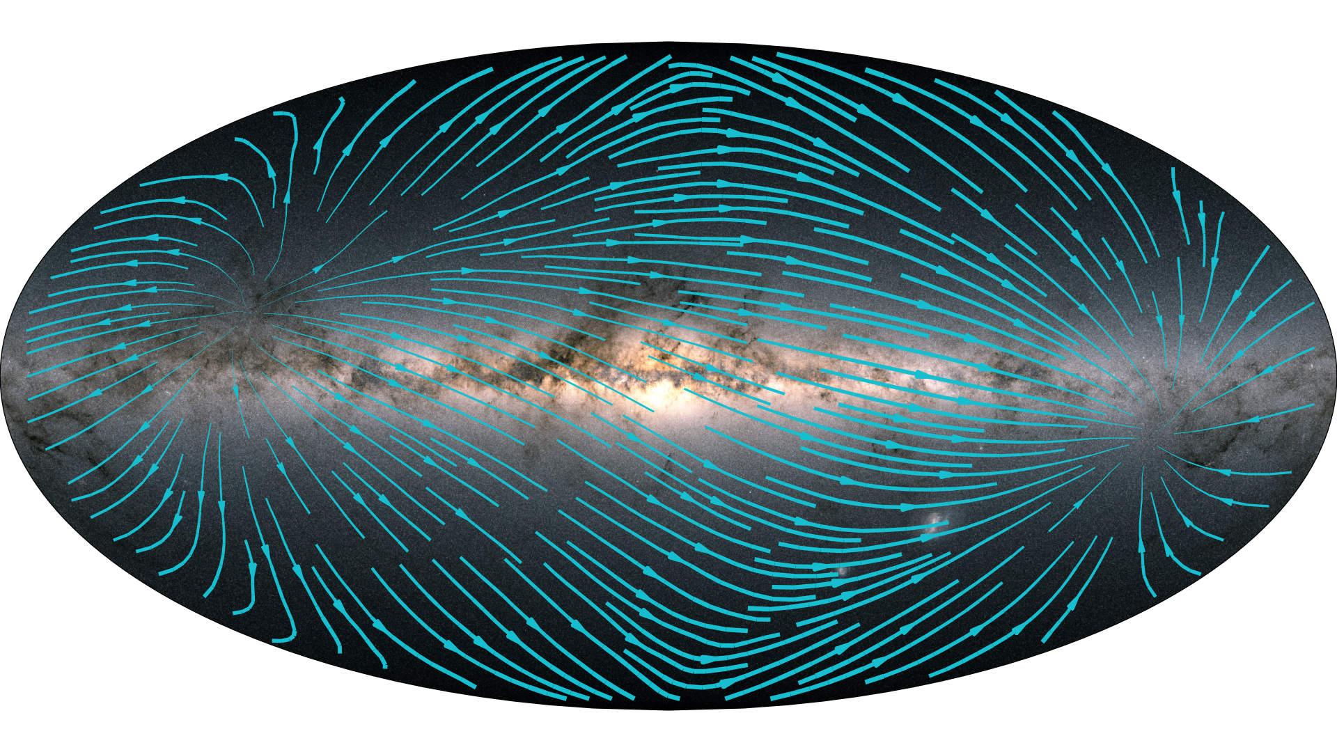
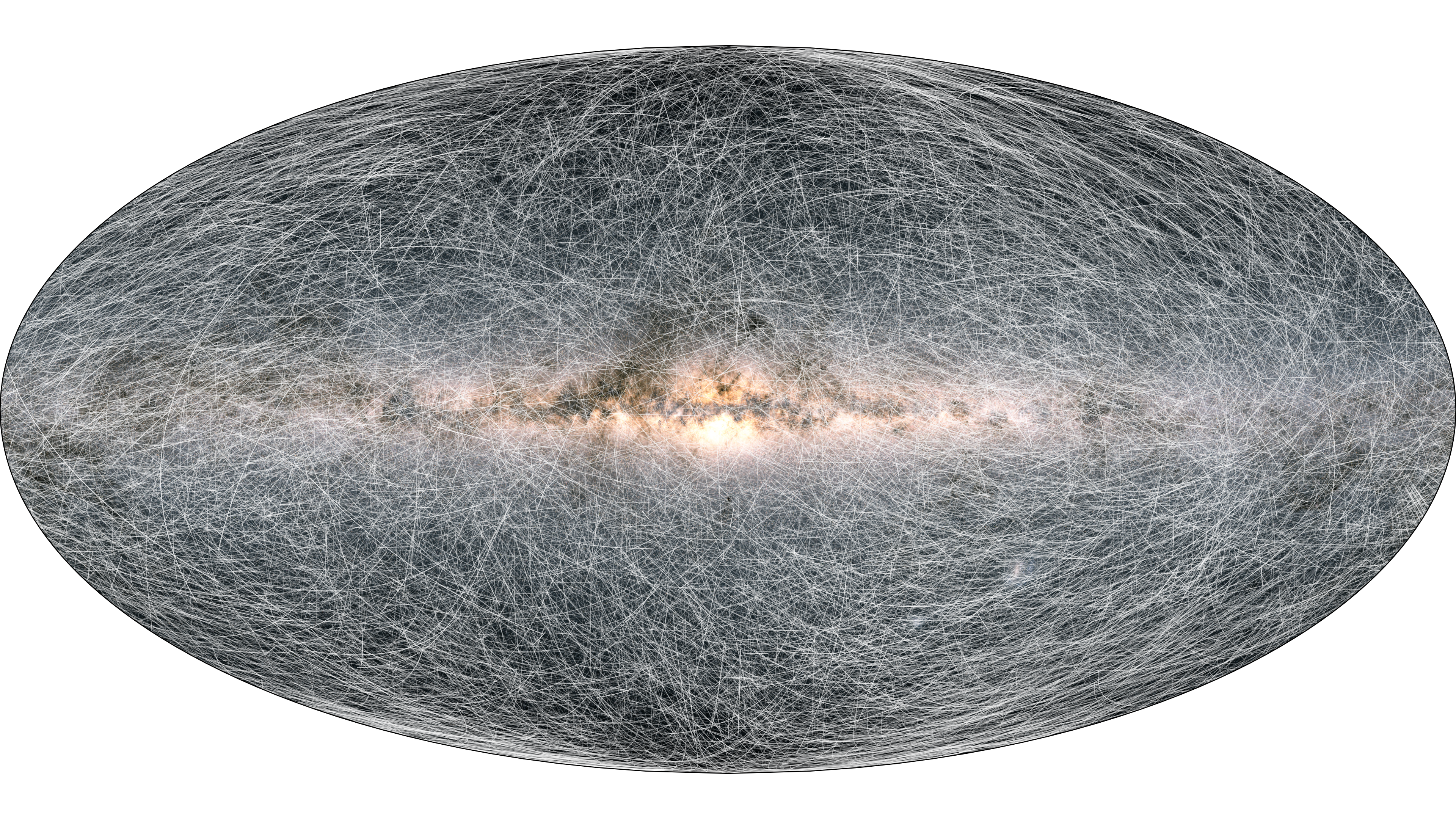
Figure 3. The average motion across the sky for stars located at 1000 parsecs from the Sun. The lines indicate the average present-day direction of motion of the stars (where the thickness is proportional to the magnitude of the proper motion), they are thus not the same as the trails in the animation. Image credit: ESA/Gaia/DPAC, CC BY-SA 3.0 IGO.
In this case the streamlines in Figure 3 show the average present day direction of the motion of stars across the sky (in contrast to the animation, the lines do not show the displacement of stars over a certain time interval). One can clearly see how the stars appear to move away from the top left quadrant of the sky and toward the lower right quadrant. The point from which the stars appear to diverge at the top left is referred to as the ‘apex’ of the sun’s motion. It is the point on the sky toward which we appear to be moving. The opposite point on the lower right, on which the stars appear to converge is called the ‘antapex’.
Strictly speaking this explanation of the appearance of the streamlines is not quite correct. The effect of the sun appearing to move toward the upper right quadrant is due to the average relative motion of the Sun and the surrounding stars. This includes the average rotation speed of the Sun and the stars around the Milky Way, as well as the deviation of the Sun’s motion from the average rotation speed at its position and the average deviations of the motion of the stars from the rotation speed at their respective positions.
The above image (Figure 3) thus reflects how the sun moves on average with respect to the surrounding stars. As mentioned before, the sun does not move uniformly (along a straight line at constant speed) but travels along an orbit roughly around the centre of the Milky Way. This means that the Sun constantly changes its direction of motion (imagine yourself moving along a circle on a merry-go-round, your direction of motion constantly changes). In order words the Sun is constantly accelerated. As explained in the story on the solar system acceleration this leads to a tiny apparent motion across the sky of the distant quasars (located at billions of light-years distance, they do not exhibit an intrinsic proper motion). This apparent motion is visualized in the following image (Figure 4).
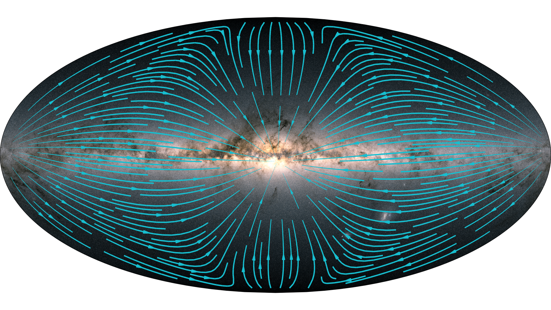
Figure 4. Apparent motion of distant quasars caused by the acceleration of the sun. Note how the motions appear to converge on a point just below right of the direction to the centre of the Milky Way. This indicates the direction in which the sun is accelerated. Here again the streamlines indicate the direction of motion, while their thickness is proportional to the magnitude of the (apparent) proper motion. Image credit: ESA/Gaia/DPAC, CC BY-SA 3.0 IGO.
The streamlines in this image again show the average direction of the (apparent) motion of the quasars across the sky. These motions are tiny! They are about a thousand times smaller than the average motion of the stars at 1000 pc shown above, and measurable in Gaia EDR3 thanks to the much improved astrometric accuracies. The streamlines converge towards a point close to the direction to the centre of the Milky Way, which indicates the direction in which the Sun is accelerated. This is what one would expect as the Sun roughly orbits around the centre of the Milky Way.
Thanks to the precise measurements by Gaia of the celestial positions of stars and quasars, and how these positions (appear to) change over time, we can see both the motion of the Sun and how this motion changes over time. The beauty of this measurement of the Sun’s acceleration is that in fact it is an absolute measurement, meaning with respect to the distant universe. The measurement therefore does not simply reflect the acceleration due to the Milky Way. What is really measured is the total acceleration of the Sun, which is dominated by the gravitational force of the Milky Way, but also contains components due to other massive bodies.
Finally, the measured acceleration is actually that of the solar system barycentre (i.e. its centre of mass) and not that of the Sun as such (where in fact the acceleration of the Sun with respect to the solar system barycentre is a thousand times larger than the acceleration discussed in the story above).
Acknowledgements:
Figure 1: The image was created by Anthony Brown, based on an idea from Stefan Jordan, and with inputs from Tineke Roegiers, Xavier Luri, Eduard Masana, and Timo Prusti. Background colour image created by André Moitinho.
Visualisation 1: The visualisation was created by Anthony Brown, based on an idea from Stefan Jordan, and with inputs from Tineke Roegiers, Xavier Luri, Eduard Masana, and Timo Prusti. Background colour image created by André Moitinho.
Figure 2: Both images are still images taken from Visualisation 1.
Figure 3 and Figure 4: The image was created by Anthony Brown. Background colour image created by André Moitinho
Published: 3 December 2020 - Credit: ESA/Gaia/DPAC
- Removed a total of (15) style text-align:center;
- Removed a total of (34) style text-align:justify;
- Removed a total of (1) border attribute.
- Removed a total of (1) cellpadding attribute.
- Removed a total of (1) cellspacing attribute.
- Converted a total of (1) youtube to youtube-nocookie.
More Gaia EDR3 stories on Cosmos
Following the journey of stars across the sky
The acceleration of the solar system with respect to the distant universe
A dive into the Magellanic Clouds
Gaia Catalogue of Nearby Stars
Gaia EDR3 releases on SCI.ESA.INT
Gaia's new data takes us to the Milky Way and beyond
Video release: Orbits of nearby stars around the galaxy
Video release: Measuring the acceleration of the Solar System with Gaia
Video release: Bridge of stars
Video release: Gaia's stellar motion for the next 1.6 million years
Image release: Gaia's stellar motion for the next 400 thousand years
Image release: Gaia's view of the Milky Way's neighbouring galaxies
Image release: Gaia's early data release 3 in numbers
Image release: The density of stars from Gaia's early data release 3 - equirectangular projection
Image release: The density of stars from Gaia's early data release 3
Image release: The colour of the sky from Gaia's early data release 3 - equirectangular projection
Image release: The colour of the sky from Gaia's early data release 3
Gaia EDR3 Release on ESA.INT
- Removed a total of (1) style float:right;